My book has just arrived and overall I am very pleased with it, but there are a few things that I will adjust when I re-order it so that it will be perfect for submission.
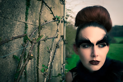
I am really pleased with the quality of the photos as they are printed very clearly so you can see all the detail of the make-up, and overall the colours are very vivid in them.
However, some of the images have printed with a slight green tinge to them which I feared would happen, as although they looked of normal colouring on my computer, when I uploaded them onto the photo book website they uploaded with a tinge to them, so when I re-order the book I will make sure that the images upload with the right colouring.
The text in the book is ever so slightly blurred as I typed it out on word and then screen-shotted it and saved it as an image then added it into the book, so the quality of the image was not as good as it should have been, so when I re-order I will make sure to save the word file as a PDF and then export it as a JPEG so the text won't be blurred when I insert it into the book.
Finally, on one of the zoomed in images of the Deer shoot, she has a strand of hair across her cheek, which when I looked on my computer was not visible but in print it shows so I will get the photographer to edit it out in photoshop.
When I amend all of these little tweaks I think the book should look the best it can and will showcase off my work well.
Book title:
For the title of the book, I originally wanted to get it embossed but could not find a suitable company that would do it on time or in budget, so I decided to create it myself.
I wanted the text to look like an old-fashioned fairytale book so decide to use the 'Old English' font which I got outlines of from the internet and printed them out.
I wanted my title, 'Beauty in the Beast' to have two capital 'B's that are bigger than the rest of the text, so printed the B out larger. I then cut out all the letters that I needed and arranged in the centre of the book and then traced round them with a pencil. Next I filled in the pencil outlines of the letters with acrylic gilding glue and let it dry for 15 minutes before placing a sheet of gold leaf over the letters and then rubbing it off leaving the leaf stuck on the letters creating a gold title.
The gold leaf did not come out as smooth as I would have liked and has a bit of a rough outline on the lettering, however it looks quite old-fashioned but also with a slight rugged modern twist which I quite like.
When my new and updated versions of the book come I will experiment with painting the lettering on with gold paint and see which style I prefer and which ever one looks best I will hand in for submission. I also feel that the hand crafted title adds another USP to the book as book titles are always professionally printed using machinery and not hand made.


